![]()
MacroQuest is an intensive photographic expedition into the tiny natural world that surrounds us. During the Quest each photographer works to discover as many of the small natural subjects that can be found in the study area and to document those subjects using high quality, close-up and macro photographic techniques. MacroQuest is not a competition per se, but participants all work hard to build as large a body of work as possible during the period.
MacroQuest will explore all areas of the biotic environment including land, air and aquatic realms. The Quest targets may include all forms of plant, animal and mineral specimens. The goal is to discover as many unique species from as many orders and families as possible.
MacroQuest will be held in designated geographical areas of rich biodiversity that include as many habitat types as possible and that are not restricted to public access. Occasionally, MacroQuest may be held on other private lands. The goal always is to capture biodiversity.
Equally important to MacroQuest is the informed identification of the subject of every photographic image and the inclusion of the location and habitat where found. Therefore, an image data form will be completed for each image and will be shared at the end of the quest period. It is requested that representative images from every participant be used in the promotion of MacroQuest and of biodiversity itself. All photographic images shall remain the personal property of the image maker and copyright to those images will remain with the maker.
Watch here for upcoming announcements. For more information, please contact: bkloflin@austin.rr.com.
Copyright © 2016 Brian K. Loflin. All rights reserved.

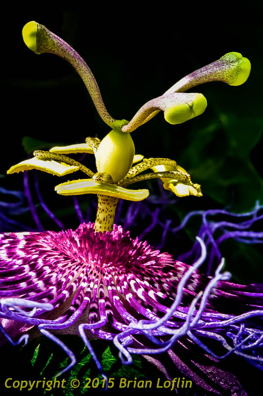
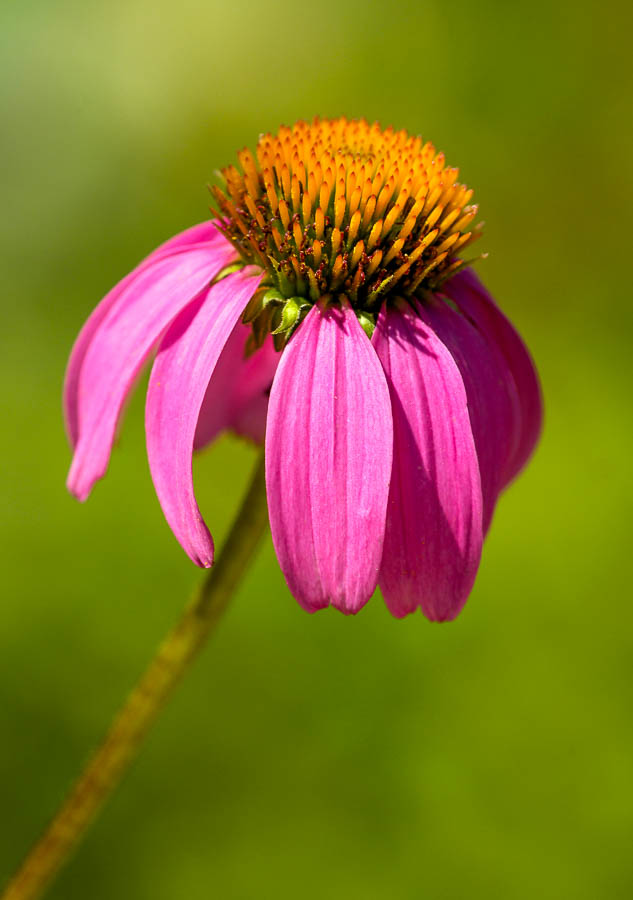 Nikon D2Xs, 200mm F4.0 Micro Nikkor, daylight.
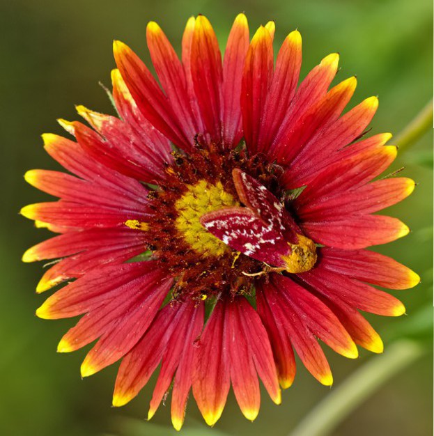 Nikon D2Xs, 200mm F4.0 Micro Nikkor, daylight.
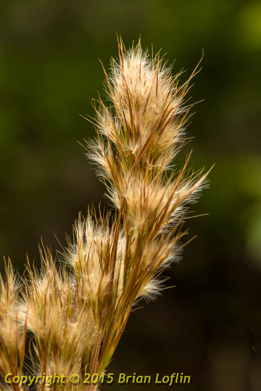
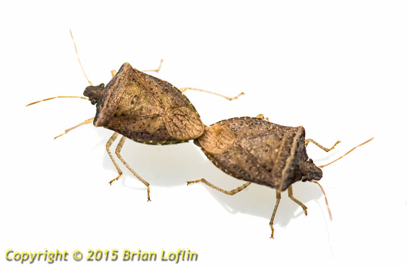
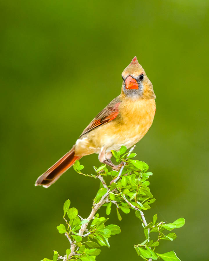

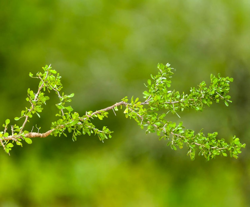
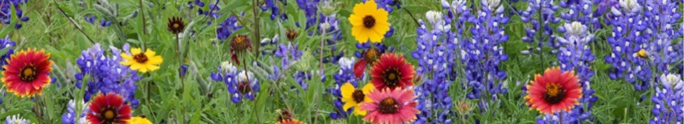
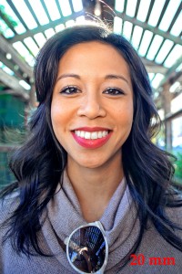
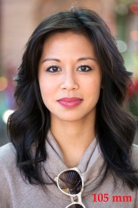
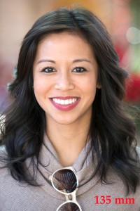
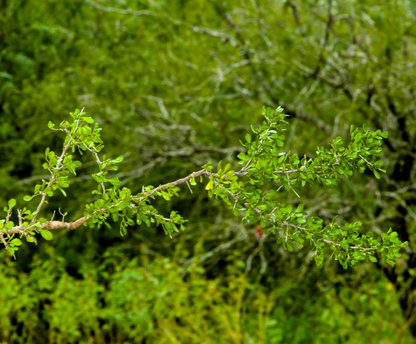 Deep and distracting background above. Few distractions and smooth, pastel background below.
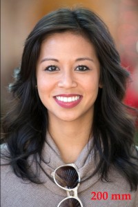